
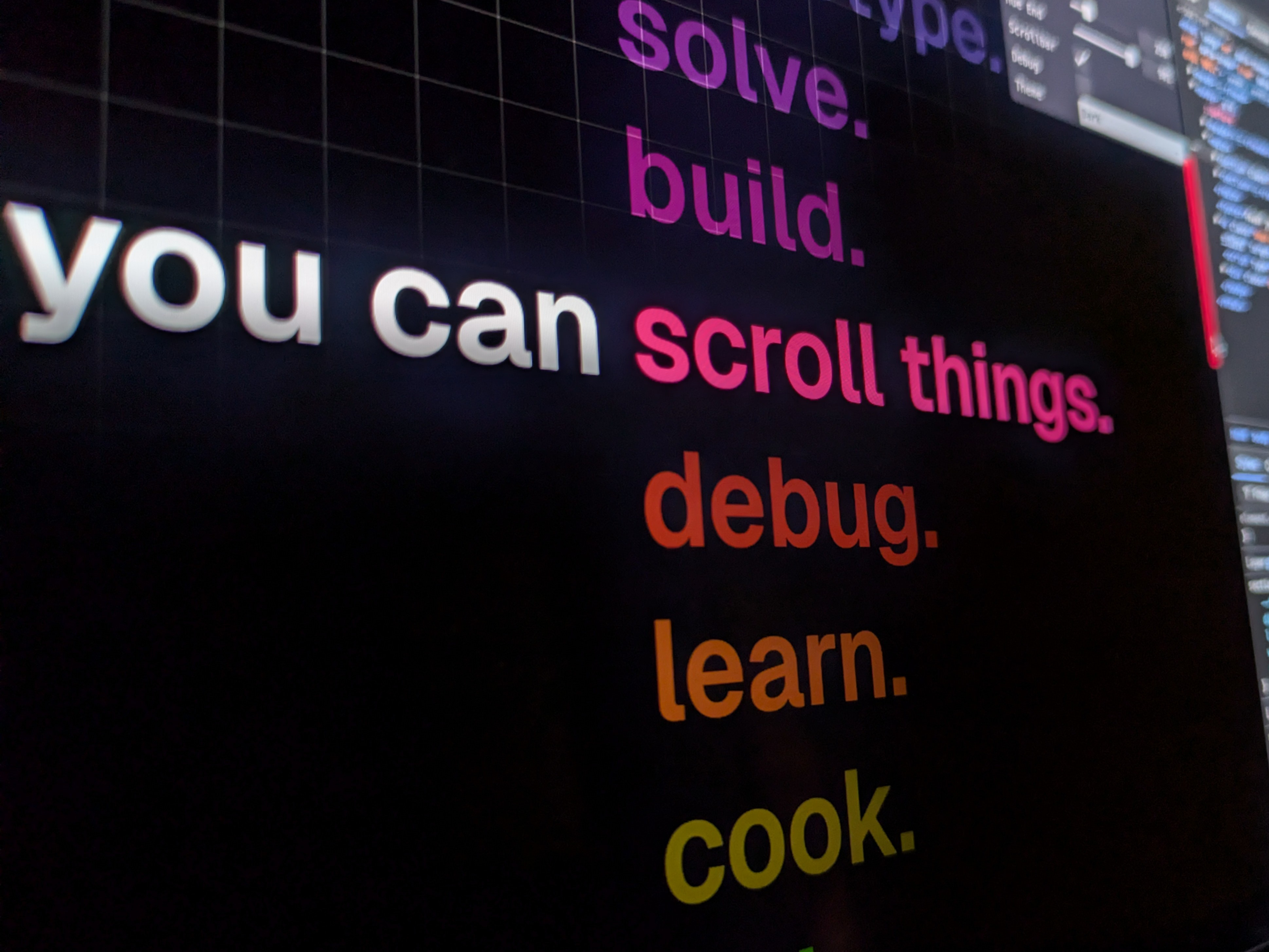
You can scroll things
Progressive scroll tricks with CSS

Happy New Year! Hope you've had a great holiday season. Many people shared 2024 highlight reels recently so it felt fitting to produce my own.
From that video, someone asked about a particular word scroller demo first seen on the Forge and Form site (scroll down to the bottom). So for today's issue, let's break it down as we ease ourselves into 2025.
So, how are you going to make it?
Markup
Like with most demos, we need to start with some HTML. It's good to think about how the content will get communicated to a screen reader user. We'll go with a section using a heading and a list. You could also play with hiding the feature from screen reader users. And then providing alternative text.
<section class="content fluid">
<h2>you can </h2>
<ul style="--count: 22">
<li style="--i: 0">design.</li>
<li style="--i: 1">prototype.</li>
<li style="--i: 2">solve.</li>
<li style="--i: 3">build.</li>
<li style="--i: 4">develop.</li>
<li style="--i: 5">debug.</li>
<li style="--i: 6">learn.</li>
<li style="--i: 7">cook.</li>
<li style="--i: 8">ship.</li>
<li style="--i: 9">prompt.</li>
<li style="--i: 10">collaborate.</li>
<!-- as many items as you like -->
</ul>
</section>One trick we're using here is using an inline style to track each list item index (—-i). This is so we can color the items "lazily". It's the easiest way until we have sibling-count/index.
Basic Styles
Before animating things, we need some foundations. When building out these interactions, think about the edge cases first. For this demo, what happens if the user views on a smaller device? In the original, they switch up the layout to vertical producing a different effect. Using a responsive font in our version means we keep the effect the same whatever the screen size. Let me know if you want me to do an issue covering responsive typography implementations.
The main trick for our animation is combining position: sticky and scroll-snap. You use sticky positioning on the section header and scroll the list past it.
section:first-of-type h2 {
  position: sticky;
  top: calc(50% - 0.5lh); /* tap into responsive line height unit */
}
html {
  scroll-snap-type: y proximity;

  li {
    scroll-snap-align: center;
  }
}
Using scroll-snap snaps each item in place and will snap the animation so you don't land on half states. You've likely seen the mandatory value used more often for scroll-snap. But here we use the proximity value. You only want to snap to an item if there's one nearby. Otherwise, your users should be able to scroll as normal. Using mandatory would be too aggressive here depending on the rest of the page content.
Remember grabbing the index of each list item? We'll use that to color each one. Use the oklch color space because it tends to "make it pop".
ul {
  --step: calc(
    (var(--end, 359) - var(--start, 0)) / (var(--count) - 1)
  );
}
li:not(:last-of-type) {
  color: oklch(
    65% 0.3 calc(var(--start) + (var(--step) * var(--i)))
  );
}
The neat part here? We can set a range and have CSS work out the color steps. All done via CSS custom properties.
The Animation
Before you even begin to animate this, you have something that gives some visual interest. We discussed a few issues ago about the progressive enhancement of scroll animation. It's the same for today's issue. We'll do a CSS scroll animation and then walk through how to do it with JavaScript too.
CSS
The CSS animation here is straightforward using a view timeline on each list item.
li {
  animation-name: brighten;
  animation-fill-mode: both;
  animation-timing-function: linear;
  animation-range: cover calc(50% - 1lh) calc(50% + 1lh);
  animation-timeline: view();
}
The @keyframes reduce the opacity of each item at the start and end. They raise the opacity and brighten each list item as it hits the middle of the viewport.
@keyframes brighten {
  0%, 100% { opacity: 0.2; }
  50% {
    opacity: 1;
    filter: brightness(1.2);
  }
}
The first and last list items have a different behavior. The first only reduces opacity and the last only raises opacity. The last one also doesn't brighten. To cater to this, restructure our keyframes and use scoped custom properties. This prevents you from creating 3 different keyframe sets.
li {
  &:first-of-type { --start-opacity: 1; }
  &:last-of-type {
    --brightness: 1;
    --end-opacity: 1;
  }
}
@keyframes brighten {
  0% { opacity: var(--start-opacity, 0.2); }
  50% {
    opacity: 1;
    filter: brightness(var(--brightness, 1.2));
  }
  100% { opacity: var(--end-opacity, 0.2); }
}
Neat.
One bonus here is that you can debug your CSS scroll animations in Chrome's DevTools. Scroll animations have a mouse icon in the Animations panel.
JavaScript
The JavaScript version is a little more involved. You can use GreenSock's ScrollTrigger and tether the scroll to a timeline animation.
import gsap from "gsap"
import ScrollTrigger from "gsap/ScrollTrigger"

if (
  !CSS.supports('(animation-timeline: scroll()) and (animation-range: 0% 100%)')
) {
  gsap.registerPlugin(ScrollTrigger)

  const items = gsap.utils.toArray('ul li')
  gsap.set(items, { opacity: (i) => (i !== 0 ? 0.2 : 1) })

  const dimmer = gsap
    .timeline()
    .to(items.slice(1), {
      opacity: 1,
      stagger: 0.5,
    })
    .to(
      items.slice(0, items.length - 1),
      {
        opacity: 0.2,
        stagger: 0.5,
      },
      0
    )

  ScrollTrigger.create({
    trigger: items[0],
    endTrigger: items[items.length - 1],
    start: 'center center',
    end: 'center center',
    animation: dimmer,
    scrub: 0.2,
  })
}
Shout out to Carl for sharing his take on this solution. It's good to see how others approach this as you can achieve it in many ways. An alternative would be to loop over the items and create a timeline for each using each item as the trigger.
Bonus
In the spirit of progressive enhancement let's add an extra touch. Something that gives it that little level of detail that takes it further.
The scrollbar-color CSS property is not completely available yet. We're awaiting Safari support. But, that doesn't mean we couldn't add something you only see in Chrome and Firefox (for now). Syncing the scrollbar color to the current item color crossed my mind early on. It's a neat challenge to solve.
html {
  scrollbar-color: oklch(65% 0.3 var(--hue)) #0000;
}
You can animate a CSS custom property on the document. And then use the value inside scrollbar-color. The neat thing is that you can tap into the hue range properties so the animation is dynamic.
@property --hue {
  initial-value: 0;
  syntax: '<number>';
  inherits: false;
}

html {
  timeline-scope: --list;
  scrollbar-color: oklch(65% 0.3 var(--hue)) #0000;
  animation-name: change;
  animation-fill-mode: both;
  animation-timing-function: linear;
  animation-range: entry 50% exit 50%;
  animation-timeline: --list;

  ul { view-timeline: --list; }
}

@keyframes change { to { --hue: var(--end); }}
You'll get a neat little progressive enhancement from this. You can also use GreenSock to make it work with JavaScript too.
In the demo, you'll notice that the scrollbar starts desaturated. For that, use the same technique but animate the "chroma" value for the scrollbar-color.
That's it! It's a neat interaction effect that doesn't need much code. And it’s a nice short way to ease ourselves into 2025. Should we break down some more demos from the "Highlight" reel in the coming weeks? Do you prefer short-form issues? Or longer ones?
Demo link: codepen.io/jh3y
On X: x.com/jh3yy
On BlueSky: bsky.app/jhey.dev
Stay awesome! ┬┴┬┴┤•ᴥ•ʔ├┬┴┬┴
THIS WEEK’S SPONSOR (AGAIN)
Is my wife, with her book “Design for Developers: Master the Basics”
Learn essential design skills to elevate your code! Design for Developers simplifies design fundamentals for devs. Create beautiful, user-friendly interfaces with confidence.
Before you go, thank you for all the feedback on the issues. My plan for 2025 is to keep going with an eye on making a site/course if that’s still of interest. We will likely start with a course titled “Foundations” around CSS animation.
As for the newsletter. One issue a month for free subscribers and many for paid. The price is also lowered to the lowest rate possible. It works out much cheaper to do an annual subscription. The lowest monthly Substack allows is $5.
There have also been requests for a Discord server. I’m not 100% sure where to start with this.
Let me know what you think ʕ·ᴥ· ʔ
Can't wait to read your wife's book 📖